ROLE

UI/UX & Brand Designer

DURATION

6 weeks

TOOLS

Figma, Miro, Google Forms

~ Press a section below to navigate ~

OVERVIEW RESEARCH VISUAL IDENTITY RESULTS CONCLUSION

BRALLIUM E-COMMERCE WEBSITE

OCTOBER – DECEMBER 2023

Project Scope: Part of Creative Labs at UCLA, Fall Quarter

Brallium's mission is to create sustainable, reusable, and multi-functional nipple covers suitable for all genders, cup sizes, skin colors, skin types, and circumstances (ie. breast cancer patients). These products were crafted from biodegradable, bacteria-resistant materials, emphasizing sustainability and eco-friendliness.

My role in this project was to design an e-commerce website and a cohesive design system for Brallium. Our goals were to inform shoppers about the product's sustainability, streamline the shopping experience, and promote body and gender inclusivity in what is a traditionally feminine-oriented space.

RESEARCH

OBJECTIVES

Before we began our research, Maleeha and I outlined two guiding questions and three goals we had for Brallium.

Maleeha and I conducted thorough research on four competitors, focusing on:

  1. Company Purpose and Incentives: Understanding their mission and motivations.
  2. Layout: Evaluating the user experience and design elements.
  3. Strengths and Weaknesses: Identifying what they do well and areas for improvement.
  4. Visual Identity: Analyzing their design systems to inform our work on Brallium.

Process: User Survey

We also created an outline for our website layout. However, we still had questions that we thought would be answered best by directly asking potential users. We created a user survey and shared it on Instagram and Reddit, collecting 30+ responses over a period of a week.

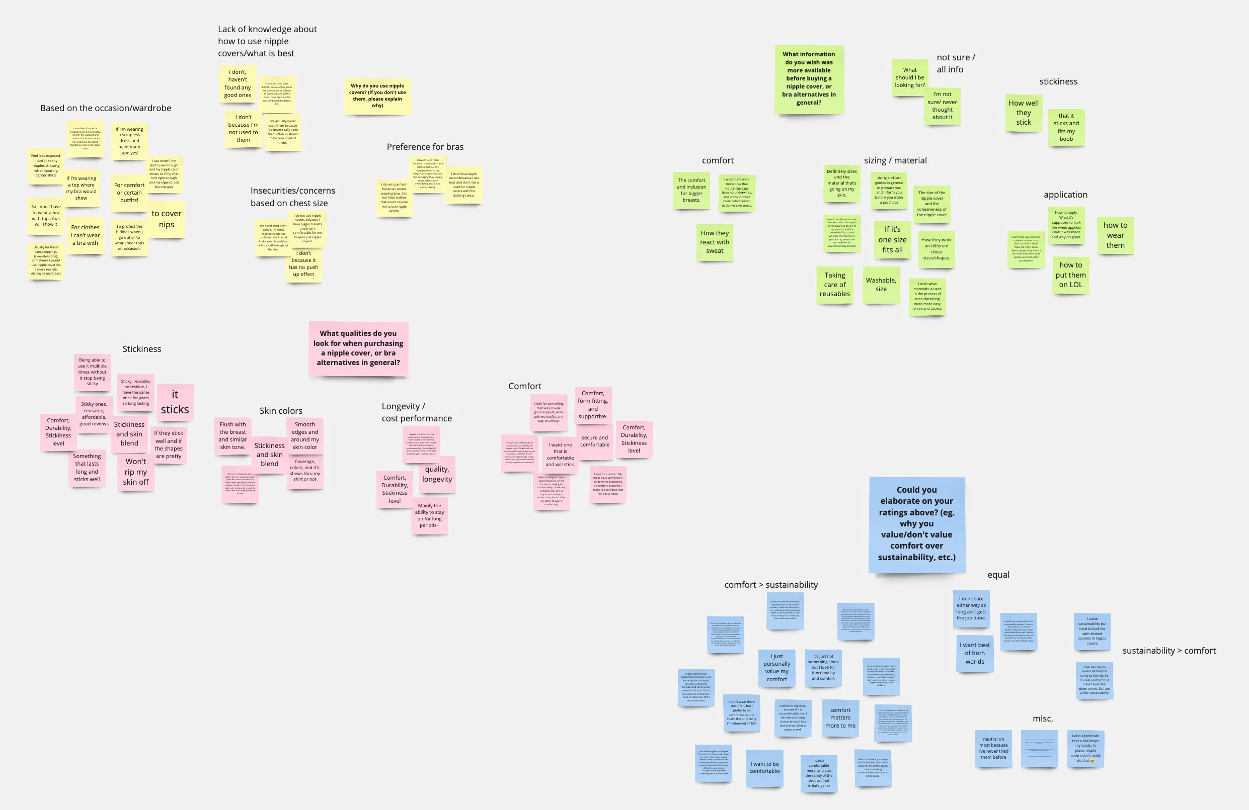
Using the survey results, we grouped together answers based on common traits into an affinity map to understand what users valued and needed most from shopping for nipple covers.

After taking note of the responses, we were able to discern two types of people who would be shopping from our platform: the experienced user and the inexperienced user. We developed two user personas to guide our thought processes on what Brallium needed.

Unfortunately, we didn't have enough time to create journey maps, but we ran through potential scenarios verbally, which helped us in organizing our pages into an information architecture.

With the research done, we ideated wireframes and finalized a low fidelity prototype for the dev teams to get started with.

VISUAL IDENTITY

LOGOS, COLORS, & DESIGN SYSTEM

For our visual identity, we started off by making three moodboards of color schemes and potential fonts. Each moodboard had a distinctive vibe that we could see connecting to Brallium’s brand identity.

Initially, we ended up selecting the first board, since the colors were unique and earthy with a pop of color. However, later while designing, we decided to go for a more monochromatic color palette.

Maleeha and I sketched out ideas for Brallium’s logo, playing on concepts of nipple covers and sustainability.

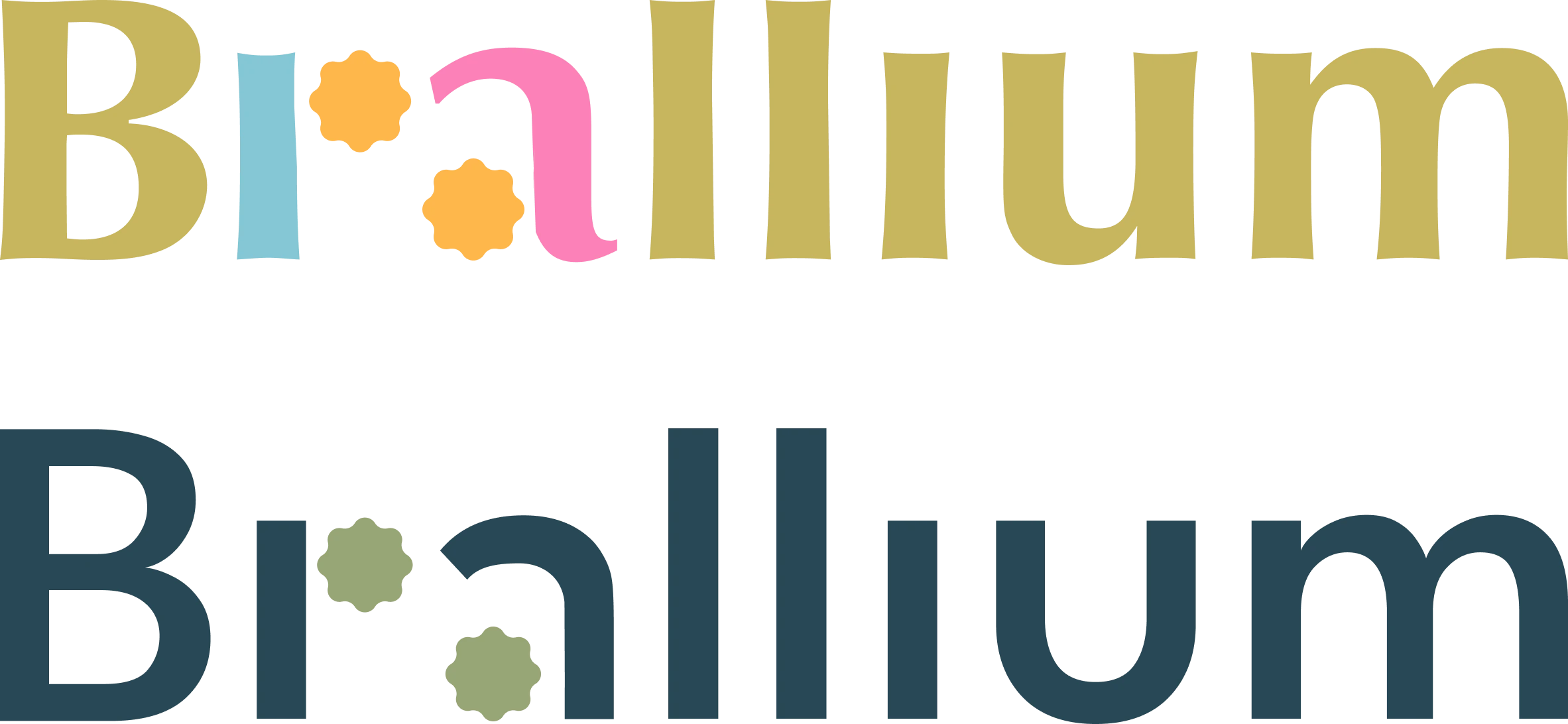
We eventually decided to create a vector logo using sketch #5 from my concepts. We spent some time looking through free commercial-use fonts and ultimately created a logo using a serif font before deciding to switch to sans-serif to create a more modern look.

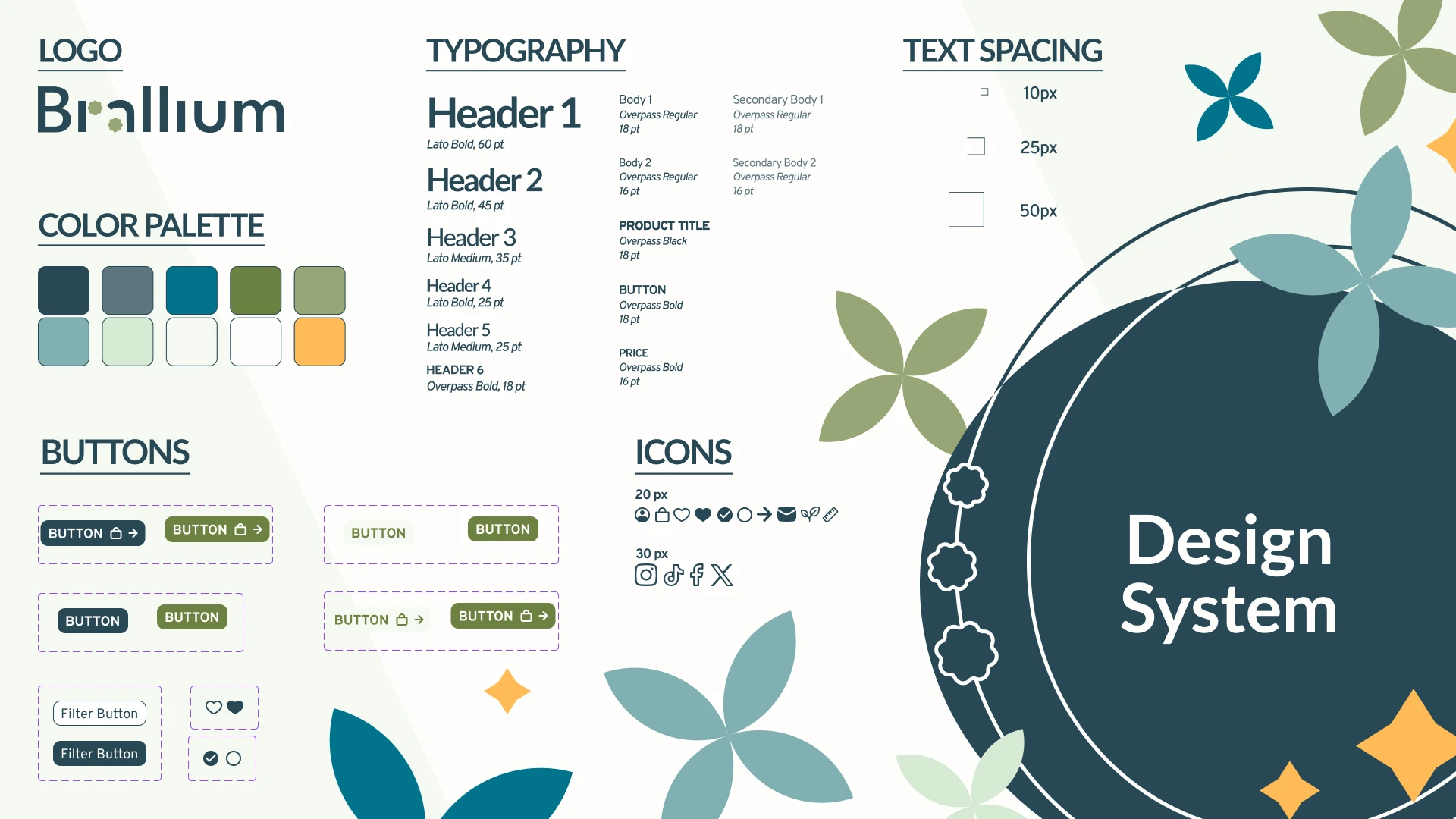
Following the creation of our logos, we finalized our color palette and created a design system. This part of our process took the longest since we wanted colors that worked with each other while following the simple contrast WCAG guidelines.

Once we had our design system complete, we moved onto creating our high fidelity prototype.

Maleeha and I individually sketched wireframes, and selected ones from each of ours that we thought worked best for the e-commerce website.

Using these sketches, we finished the design of our low-fidelity prototype within the first two weeks of our project for the developers to get started with.

When designing our high-fidelity prototype, we often found ourselves unhappy with our designs but unable to pinpoint where the issue lay. Eventually, we realized that we were trying to strictly follow the low-fidelity prototype even when we realized it wasn’t working. So, we scrapped our previous designs and kept iterating and making new versions. Here’s how our landing page design changed over our design process:

Throughout this process, we checked in with Bella, the project lead, to ensure that the design and branding was following the direction that she was envisioning.

📷

NO PRODUCT PHOTOS

A big challenge we faced while creating wireframes, low fidelity, and even high fidelity prototypes was that Brallium’s product was overseas where it was developed in China. This meant that we were unable to access or take product photos except for three. Due to this, we were unable to have a focus on photography on the website in the immediate future. We solved this problem by focusing more on graphics and motifs of sustainability.

RESULTS

THE FINISHED PROJECT

The final e-commerce website allows shoppers to gain insights about nipple covers, sustainability, and Brallium while being accessible to inexperienced and experienced users alike. Shoppers can understand the impact of both their purchase and their support for Brallium. Unlike competitors, Brallium is gender-neutral through its photos and assets with an emphasis on inclusivity and diversity.

View our high-fidelity prototype here.

View our CL Demo Day deck below!

CONCLUSION

KEY TAKEAWAYS

  1. My first experience with user experience research.
    Through this project, I got the opportunity to learn and follow the UX research process and make thoughtful decisions behind designing and branding. I'm incredibly grateful to my partner Maleeha for leading me through the process and teaching me what I needed to know under such a short time frame.
  2. Never give up!
    It was easy to feel disheartened while making the high-fidelity prototype since we didn't have product photos, only had two designers, and were on a big time crunch. However, we kept thinking and making new iterations that led up to our finalized design. While I know I should keep trying, it was really encouraging to see the results of pushing through.